Shared with You
On TikTok, sharing a video with a mutual friend is the default way to say "I'm thinking of you", and it costs the sender almost nothing. But for the receiver, opening the Inbox to a red badge of 20 new messages stirs a tangle of feeling cared-for and feeling pressured. Watching a friend's shared videos isn't just enjoying videos; it comes with the chore of responding. I came to describe it as "working through a stack of memos."
Design Challenge: User A shares 20 videos with User B, but B only watches 2. How do we get B to watch more?
I started as a TikTok user myself, living inside the product to work out why this happens.
The sender can fire off a share in the gaps between videos (one tap to blast a single clip to nine friends) without ever breaking their FYP scroll. The receiver's cost is far higher. "I watched this video" means opening the DM, watching the clip, reading the content, guessing why the sender sent it, then replying with text or an emoji. The whole interaction is a chain, not a single action.
That cost pushes the receiver to skip the "type a reply" step whenever possible, answering only the highest-priority clips: the one where the sender explicitly asked a question. But it also means that even after the receiver has watched all 20 and replied to the two they liked, the sender can't see where the receiver actually is. Of 20 clips, only two look "seen", and that gap stings.
The deeper reason isn't cost. Everything on the TikTok home feed is infinite, algorithm-fed, and scrolled forward. But the moment a share happens, the video is pulled out of its native container and dropped into one with entirely different rules. DM videos are finite, and the receiver has to scroll backward to catch up on earlier content, the exact opposite of the habit they've built. The video itself hasn't changed; what changed is the container it lives in.
On the FYP, everything you scroll into is carefully prepared for you by the algorithm (content, length, the creators you follow), so you scroll down with anticipation. What a friend sends you, on the other hand, is based on that friend's read of you and that friend's own algorithm. Sure, you'll find moments of resonance, but you'll just as easily find things you don't connect with. This content isn't organized for you; it has no priority at all: it's treated uniformly and ordered by time, and it's easy to lose patience partway through.
These reasons explain the scenario, but when I revisited the question ("get B to watch more videos"), I didn't think that was the real goal. Sharing is a proven retention driver for TikTok: people who share, and who receive shares, stay longer. So the real goal is to "make the social graph stronger, and through that, retain users." And User A shares because A wants to connect, wants to be seen.
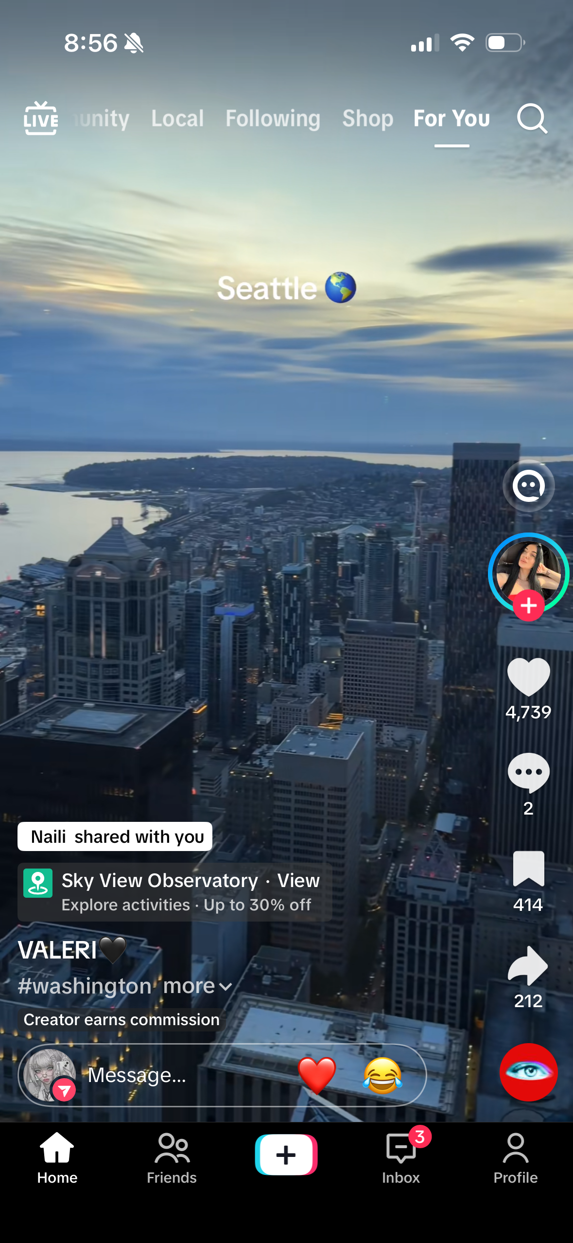
So even though users can already scroll into a friend's shared video on the FYP, content-based sharing shouldn't end at "watched." It should build social connection on top of that. Simply watching the video doesn't align the receiver's and sender's mental positions: the sender doesn't know the receiver watched, and the receiver still has a message sitting in their DM. What we need is a response that holds true for both sides, turning sharing into a two-sided loop.
I wanted to turn sharing from today's largely one-way act into a two-sided, looping interaction. Building on the scenario analysis, I broke that goal into four actionable directions:
Turn sharing from an inbox you scroll backward through into a feed you scroll forward down.
Free "I got it / you've been seen" from being bound solely to a typed reply.
The sender knows the share landed; the receiver no longer feels they're doing a chore. Keep the loop turning.
Reshape video priority around intent, interactivity, and timeliness.
From the four redesign goals, balancing user experience against user needs, I framed four How-Might-We questions:
How might we turn shared videos from a to-do buried in chat history into a feed you can scroll straight through?
How might we let "I saw it / I felt it" be conveyed without relying on a typed reply?
How might we make the sender feel received and the receiver feel like they're discovering, so sharing becomes a loop, not a task?
How might we reorder shared videos by intent, interactivity, and timeliness so the most worthwhile content comes first?
For each question I studied TikTok and its peers in depth (Xiaohongshu, Douyin, Instagram, Snapchat), comparing across multiple dimensions and thinking from both the sender's and receiver's side to imagine possible solutions. Here's my design strategy for each HMW:
How might we turn shared videos from a to-do buried in chat history into a feed you can scroll straight through?
"Shared with Me" Feed
✓ Shipped directionA shared video is still TikTok at its core, yet today it's packed into a DM you have to scroll backward through. I wanted to put it back into a container that matches the FYP, so that "watching" feels effortless again. My idea: add a "Shared with You" tab on the Friends page: a vertical, full-screen player that shows only what friends have shared. Alongside the video, it surfaces the friend who shared it, with a floating quick-reply button at the bottom so you can respond as you watch. For the receiver, shares are handled with the same interaction as the FYP, no need to enter each friend's DM one by one. For the sender, the receiver's barrier to processing a share drops, so a response is far more likely to happen.
The Shared Feed fixes the most fatal problem: DM messages scroll upward, so you hit the bottom, hit repeats, hit things you've already seen. By consolidating friends' shared videos, it shapes a new video stream driven by social relationships, and the low-cost interaction it offers fits users' mental model and habits best. You no longer have to back out of a video in the DM to read a friend's comment: in the Shared Feed you scroll and read their comment at the same time, tapping a reaction on the way. The cost of watching shared videos drops dramatically. And Smart Reactions, auto-matched to the video's tags and the sender's comment, are exactly the context-fit, one-tap response this container needs, the thing that lets the sender feel seen.
In-DM jump order + Thread Summary
Today, if you want to watch every video in a DM, you have to scroll all the way up to the earliest one, so why not flip the whole interaction? My idea: when you open the thread, jump straight to the start of what's unread, while AI condenses the piled-up shares into a categorized summary by tag. For the receiver, there's a full view: you can scroll down from the earliest video, keeping the FYP-consistent interaction. For the sender, even if the other person didn't watch everything, the key points still get across.
Why I didn't pick it · Jumping through videos treats the symptom, not the cause: you're still inside the DM container. And short video is heavy on video, light on text; the content resists being "summarized," and once a summary is off, it distorts what the friend meant to share.
Inbox Value
Turn a friend's inbox message from a "task notification" into "content that draws you in." The DM's red badge counts only the text messages someone sent; the preview under their name shows the text directly, while the video count is designed as a separate pill, so you can clearly see how many are text versus video. If there's no text message, AI helps summarize the gist of the videos. For the receiver, you can judge whether this is worth watching now before you even enter. The sense of a chore turns into pull. For the sender, the value of the content is presented up front, so it's more likely to get opened.
Why I didn't pick it · The Inbox isn't only DMs: it also holds system, content, and other messages, so restructuring the information architecture carries high cost and risk.
How might we let "I saw it / I felt it" be conveyed without relying on a typed reply?
Smart Reactions
"Got it" shouldn't only be expressible by typing, yet today's quick emoji replies are a fixed three (😍😂😳), which don't fit every video. Taking a cue from Xiaohongshu's quick replies, which suggest smart responses under each post based on its content, I designed context-aware quick reactions for TikTok videos. AI reads the video's tags and the sender's comment and shows three dynamic "emoji + text" reactions in the existing reply bar (a food video might offer Want it😋 / I'm in😄 / Let's go), replacing the fixed emoji. One tap sends it, no keyboard required. For the receiver, even without finishing the whole clip you can land a lightweight, context-appropriate response. For the sender, feedback closer to what they hoped for arrives instantly.
Interaction Receipts
Let a strong interaction like bookmarking also count as a response: when the receiver watches and bookmarks a friend's shared video, the system auto-sends a lightweight receipt in the DM (e.g. [Name] bookmarked your video), so the sender knows the other person cared without waiting for a deliberate reply. Likes and comments are more incidental behaviors and touch on privacy, so they aren't shown.
Why I didn't pick it · Bookmarking is a fairly private act. It might mean "I want to go there with you," but from another angle it can become the pressure of being watched, and the receiver may not want to be tracked that way. So I decided the only signal the sender should ever see is an action the receiver deliberately chose to make.
How might we make the sender feel received and the receiver feel like they're discovering, so sharing becomes a loop, not a task?
Rebuild the DM into a "shared space"
The video cards in today's DM don't carry any deeper social meaning. Instead of each video being a card, the play icon in the middle could be redesigned as an "open" affordance, and the message wrapped as a sticker stuck onto the video card. Each time you finish watching, the receiver is nudged to send a new video back.
How might we reorder shared videos by intent, interactivity, and timeliness so the most worthwhile content comes first?
Priority Slot Queue
Order shared content by "how worth responding to it is," not by time. When you open a friend's shared videos, the player runs a ranking algorithm that arranges the queue into a deliberate emotional flow. Highest priority is action / high-intent content: clips a friend commented on, ones with a location tag, an event invite, or a shopping link. Second is a quick dopamine hit: a short, funny meme to shift the mood. Third is deep engagement: longer, more information-dense videos. The profile on the left shows which friend shared it, and commented content is surfaced first. For the receiver, you spend your limited attention on what matters and is most worth answering first, and mixing content types avoids the fatigue of scrolling through the same kind back to back. For the sender, high-intent content like a restaurant rec or an event invite gets seen first, making it far more likely to earn the "let's go this weekend" response they were actually hoping for.
Why I didn't pick it · A friend's shares are deeply personal. Having an algorithm and AI decide "whose is more worth watching" is both hard to get right and potentially uncomfortable, and it drags the FYP's ranking logic back into a space that should be about people first.
Seen Sync
If the receiver has already scrolled past a video on the FYP, the system auto-collapses that clip in the DM and marks it read. And if, while scrolling the FYP, a recommendation overlaps with a friend's share, the video shows a share label with a one-tap reply entry point.
Why I didn't pick it · This looks like it lightens the load, but it quietly assumes "the user doesn't want to see a repeat video." In reality, if someone wants to rewatch to feel the in-joke with a friend and laugh again, that's a different solution entirely. I'd also considered syncing "I watched it" back to the sender so they'd know you'd seen it, but "seen" is a passive signal that shouldn't leak. It easily becomes the pressure of being watched, and people may not want others knowing what they've seen. So "seen" is used only to de-dupe for myself, never exposed outward.
Everything so far works the receiver's side. But if the sender blasts out 20 low-intent videos at once, no amount of receiver-side optimization will help. So is there a way to reduce "share spam" rather than just increase "consumption"?
Intent Shortcut
Let the sender express "why I'm sending this to you" at the moment of sharing. As they share, they see quick options tied to the video's context: a restaurant video might show "Go together?" or "When are you free?" Once the sender taps one, the receiver sees not just the video but this intent tag. For the sender, it's a lightweight way to convey intent without typing. For the receiver, it's faster to understand why this video was sent to them, and easier to respond appropriately.
Unlike a regular video layout, the Shared with You page centers on the friend and the act of sharing. I deliberately played down the original video's title and caption, compressing them into a single line as a pill, and instead emphasized the friend who shared it, the time, and the comment they left you. For the sender, shared videos are more likely to be watched and replied to.
At the same time, the same video shared by multiple people won't appear twice, and videos no longer exist as DM messages: the new inbox shows only the count of text messages. Once the two are separated, users can actually enjoy this friend-shared feed, and start to wish friends would share even more. After they finish scrolling, they're guided back to the FYP to share new videos, handing off from receiver to sender and driving the two-sided loop.
I shipped this in two iterations: a first working build, then a rework of the share card based on what that build surfaced. The second version below is the current final build.
First final build
The first version turned the concept into a working "Shared with You" tab: a friend-first card carrying the sharer, their comment, and Smart Reactions, backed by reply-value ranking. It proved out the flow, but living with it showed the left side of the card was doing too much at once, crowding the video.
Final build
So I iterated on the first build. Re-zone the left, leave the right alone. The right-hand action rail stays as TikTok has it today; the left collapses into three blocks (share info, video info, and the response area), each with its own job, a clearer hierarchy, and no longer crowding the video frame. This is the current final build.
What this whole design has to keep turning is one closed loop: the sender's share is seen and answered by the receiver at low cost; the receiver feels like they're discovering and the sender feels seen; and after a satisfying scroll the receiver returns to the FYP as a new sender.
Send a video to a mutual friend, with a hint of intent.
Scroll forward down the Shared Feed instead of backward through a DM.
Smart Reactions send in one tap, no typing.
Context-fit feedback arrives; the share truly lands.
After a good scroll, back to the FYP to share something new.
I first used Claude Design to pin down TikTok's design system from its current UI; then used Claude to write my ideation into more detailed markdown that spelled out the whole workflow; and finally handed the markdown and the design system together to Claude Code, iterating to generate the final designs.
Early in ideation, I also had Claude, Gemini, and ChatGPT act as a design lead to critique and pressure-test my ideas, probing where the holes were and where I wasn't being clear.
 Claude
 Gemini
 ChatGPT
Some of my solutions are small, low-cost tweaks (Smart Reactions drop straight into the existing reply bar); others touch structure (an entirely new Shared Feed). What I kept wrestling with was "how far to change it": stay within TikTok's current habits, or build a genuinely new interaction.
Research and validate with real users again. Right now this is all reasoned from my own experience. I'd talk to real users to surface motivations and ideas I may have missed, use their insights to drive new ideation, and let real users validate whether they'd genuinely be more willing to watch shares.
Try bolder directions. What would I do if this weren't TikTok's context? What could I do if technical constraints were off the table?
Weigh feasibility against worth. Rank the solutions by cost and benefit so it reads like a roadmap (ship Smart Reactions first, then the Feed) rather than a flat pile of features.
Validate "success" with real data. I've already defined three signals (share response rate, scroll-in depth, and the sender's sense of being seen), but they're still just my reasoning. The next step is to run these signals with real users and let the data tell me whether the design actually holds.